EXHIBIT B
Our Mission
DISQ is a Lifestyle Brand rooted in superior technology and deep care for its Retailers and Users that results in superior value over any other alternative.
While primarily a B2B company, we create value for all of our stakeholders, inside and outside the company, up and down the supply chain; while elevating the consumer experience in a responsible and sustainable way.
We are a modern company who embraces the values of the 21st Century.
Brand Voice
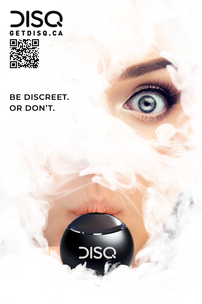
DISQ is modern, confident, and subtly rebellious. It is crafted to appeal to a hip, tech-savvy audience that values discretion and quality in their vaping experience.
Our taglines “Discreet. Dependable. Disposable.” and “make every puff count” emphasize reliability and an elevated user experience, distinguishing it from other products in the cannabis market.
Our tone is both sophisticated and approachable, aiming to create a sense of an elevated experience while remaining accessible.
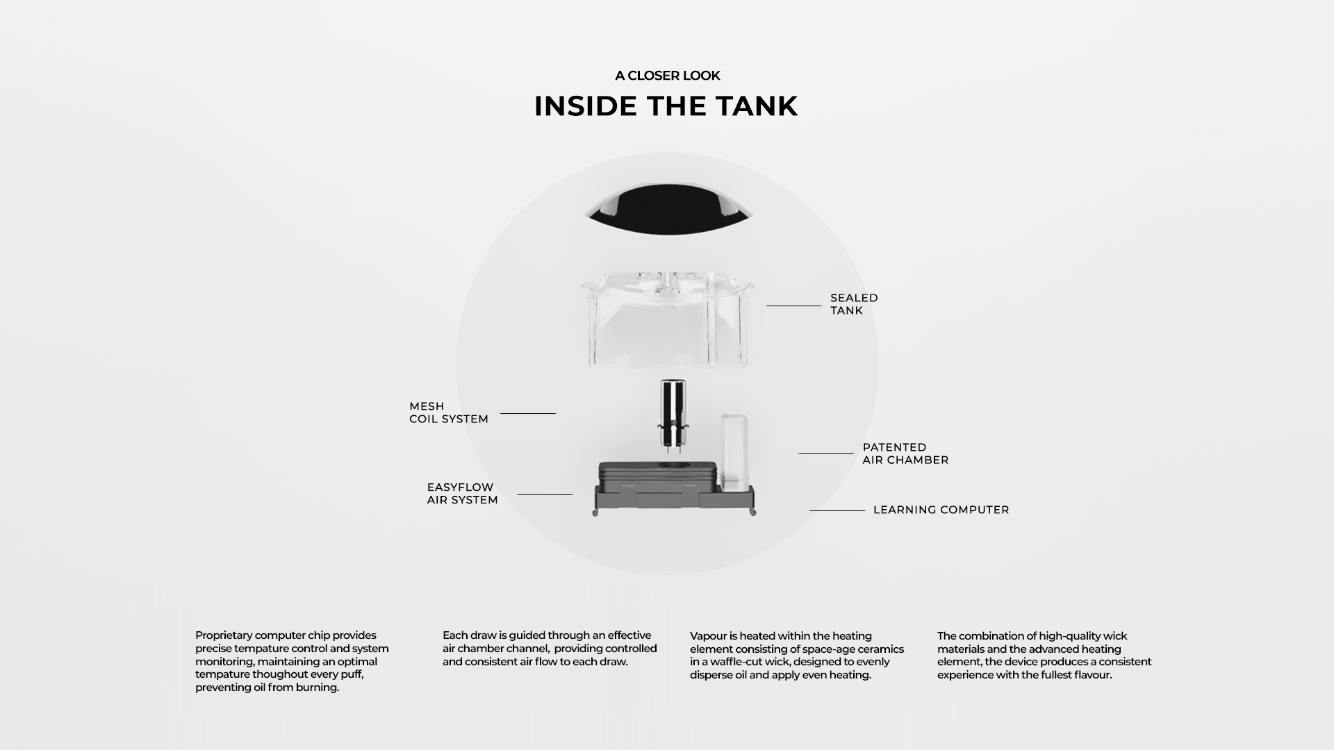
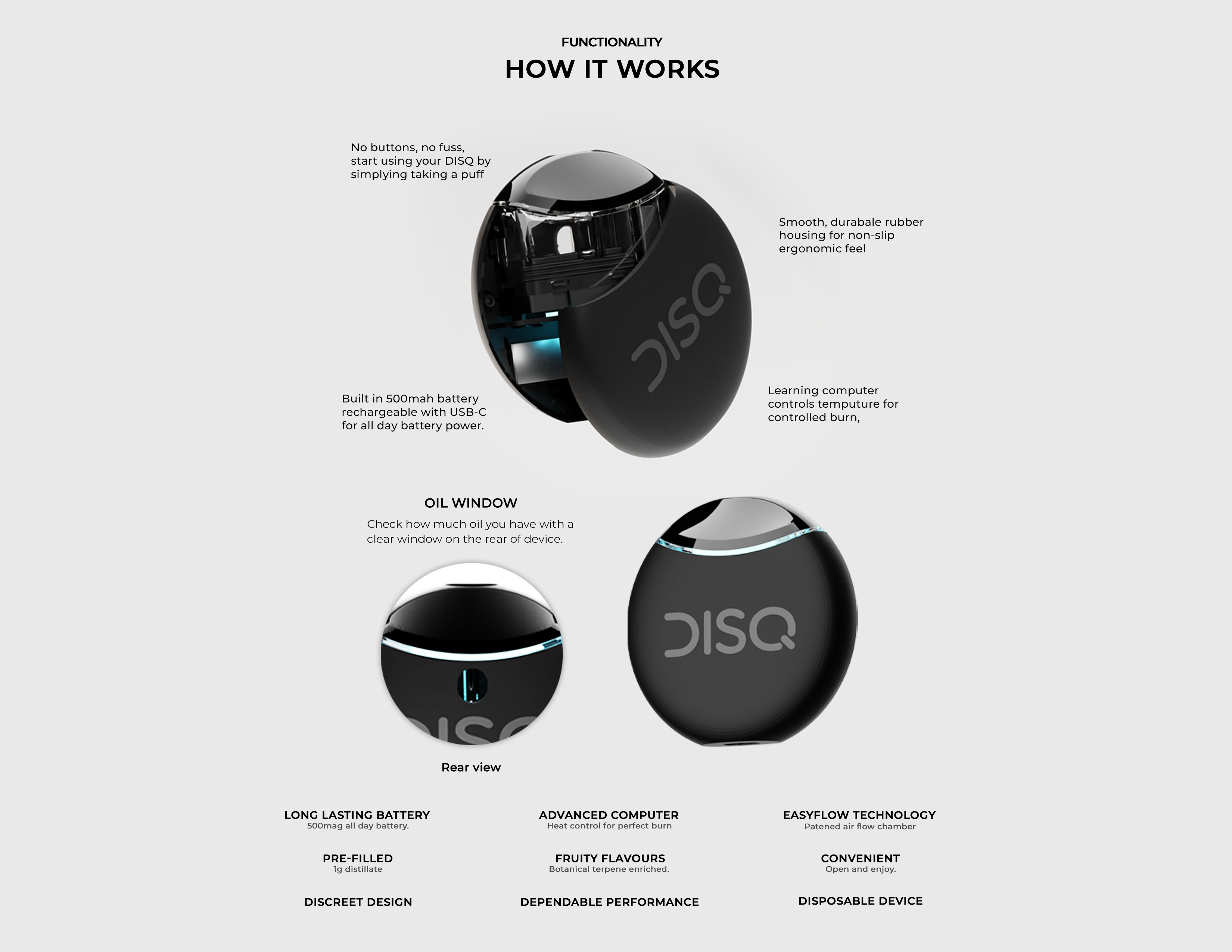
By focusing on the technological advancements of our product (e.g., EasyAir technology, sealed tank coil), DISQ reinforces its commitment to innovation and quality.
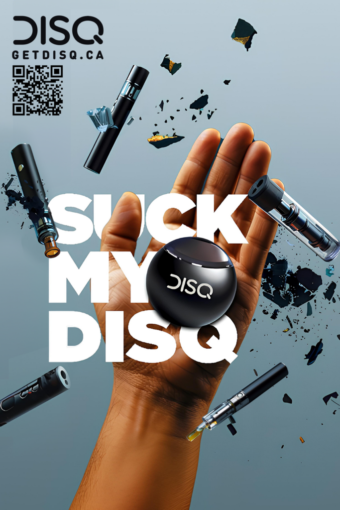
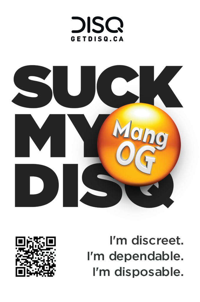
Our brand also uses a playful yet edgy tagline “suck my disq,” which conveys a sense of boldness and a touch of humor, appealing to an audience that appreciates a blend of wit and attitude. We are playful, never crude nor overt in this use.
Overall, our brand voice is designed to resonate with consumers who are looking for a premium vaping experience, at the best possible price, that aligns with a modern, on-the-go lifestyle, while also appreciating the understated but impactful design of the product.
DISQ Brand Guidelines for Intellectual Property (IP) and Logo
By following these guidelines, DISQ can ensure a strong, cohesive brand identity that resonates with its target audience and upholds the integrity of its intellectual property.
1. Brand Identity Overview
• Brand Name: DISQ
• Taglines: “Suck My Disq”, “(I’m) Discreet, (I’m) Dependable, (I’m) Disposable”,
“Make Every Puff Count”, “Anything But Square”,
“Fits Into Your Life, As Easy As It Fits Into Your Palm”
• Core Values: Discreet, Dependable, Innovative, Bold, Playful, Premium Quality
• Target Audience: Young adults (19-36 years) who value quality, discretion, and modern design in their vaping experience.
2. Logo Usage Guidelines
• Primary Logo: The DISQ logo should be used consistently across all platforms and materials to maintain brand integrity. It consists of a modern, sleek typeface that reflects the brand’s emphasis on innovation and discretion.
• Color Palette:
o Primary Color: Dark Gray or Black (#000000) for sophistication and subtlety.
o Secondary Color: Deep Blue (#1A1F71) for a touch of elegance and trustworthiness.
o Accent Color: Soft White (#FFFFFF) for clean and minimal design.
• Size and Spacing:
o The logo should never be resized smaller than 1 inch in width to ensure legibility.
o Maintain a clear space around the logo equivalent to the height of the “D” in DISQ, ensuring no other elements encroach upon this space.
• Do’s and Don’ts:
o Do use the logo on a clean, uncluttered background.
o Do use the logo in its original colors or in black and white.
o Don’t stretch, distort, or rotate the logo.
o Don’t place the logo on a busy or patterned background that reduces its visibility.
3. Typography
• Primary Font: The DISQ logo uses a custom, sans-serif typeface that conveys modernity and clarity. For other branding materials, use a similar sans-serif font like Helvetica or Arial.
• Secondary Font: For body text and longer content, a clean and readable font like Roboto or Open Sans is recommended.
4. Imagery and Photography
• Style: Images associated with the DISQ brand should be high-resolution, with a focus on minimalism and sleek, modern aesthetics. The images should align with the brand’s emphasis on discretion and sophistication.
• Tone: Imagery should evoke a sense of calm, control, and refinement. Avoid overly bright or chaotic images that do not match the brand’s subtlety.
5. Brand Voice and Tone
• Voice: The brand voice should be confident, modern, and subtly rebellious, with a hint of playfulness. It should communicate reliability and sophistication without being overly formal.
• Tone: Keep the tone conversational yet professional. Use humor sparingly to align with the tagline “suck my disq,” ensuring it comes across as clever rather than crass.
6. Legal Considerations
• Trademark: The DISQ logo and tagline should be trademarked to protect the brand’s intellectual property. Ensure that all usage is in compliance with trademark laws, and include the ® or ™ symbol as appropriate.
• Licensing: Any use of the DISQ logo by third parties is governed by our licensing agreement that specifies the terms of use, ensuring the logo is not altered or used in a way that could harm the brand’s reputation.
7. Digital and Social Media
ADVERTISING, PROMOTION, MERCHANDISING AND SOCIAL MEDIA MUST CONFORM TO FEDERAL, PROVINCIAL & LOCAL REQUIREMENTS IN YOUR AREA
• Profile Images: Use the primary DISQ logo as the profile image on all social media platforms to ensure consistency.
• Social Media Posts: Maintain the brand voice across all platforms. Posts should be sleek, visually appealing, and aligned with the brand’s values of discretion and sophistication.
• Hashtags: Use branded hashtags like #DISQVape, #SuckMyDisq, and #DiscreetVaping to create a cohesive social media presence.
8. Brand Applications
BRAND APPLICATIONS MUST CONFORM TO FEDERAL, PROVINCIAL & LOCAL REQUIREMENTS IN YOUR AREA
• Packaging: Packaging should reflect the brand’s commitment to quality and discretion, using the primary color palette and logo. The design should be minimal yet functional, emphasizing the premium nature of the product.
• Merchandise: Any branded merchandise, such as apparel or accessories, should adhere to these guidelines, using the logo and color palette consistently.



This product is not yet available.
please check back later.